How to Customise Your Resume for the Country You Want to Work In
Read more >
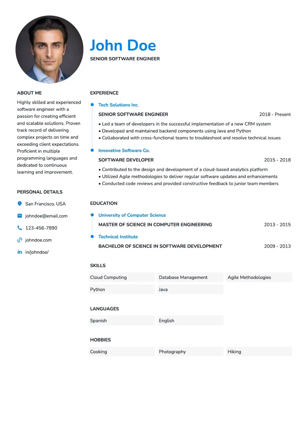
Stick to classic, readable fonts that look clean on screen and print well. Avoid anything too decorative or difficult to scan.
A clean layout improves readability. Don’t crowd the page—white space helps guide the eye.
Keep it simple. Use one accent color if desired, but avoid clip art unless the role or region requires it.
Always export your resume as a PDF to preserve formatting across devices. Name your file professionally (e.g., firstname_lastname_resume.pdf).
Avoid tables, text boxes, and graphics. Stick to standard section titles (e.g., “Experience,” “Education,” “Skills”) to help applicant tracking systems parse your resume correctly.
Your resume design should highlight your content—not distract from it. Use clean fonts, consistent spacing, and professional structure to make a strong impression.
Not sure if your formatting is hurting your chances? Try our resume & CV maker online for pre-formatted, ATS-friendly templates.


More from the blog